Indietool
How to Create Product Prototype Quickly and Validate Demand
Most advice about creating a product prototype starts with screens, colors, and interaction details. That order is backwards. A polished prototype tested with the wrong people can produce confident approval for a product nobody urgently needs, while a rough sketch shown to the right users can expose a fatal misunderstanding before you spend weeks building it.
A prototype is valuable because it reduces uncertainty. It should answer one difficult question at a time, using the cheapest artifact that can produce credible evidence. That means testing the problem before polishing the solution, recruiting people who resemble actual buyers, and treating clicks or compliments as signals rather than proof of demand.
Table of Contents
- Why Fidelity Is Not Your Real Problem
- The Five-Stage Prototyping Loop
- Choosing the Right Fidelity Level
- The Two Hidden Gaps in Most Prototype Guides
- Building Your Staged Evidence Ladder
- From Prototype to Launch - What Actually Happens
Why Fidelity Is Not Your Real Problem
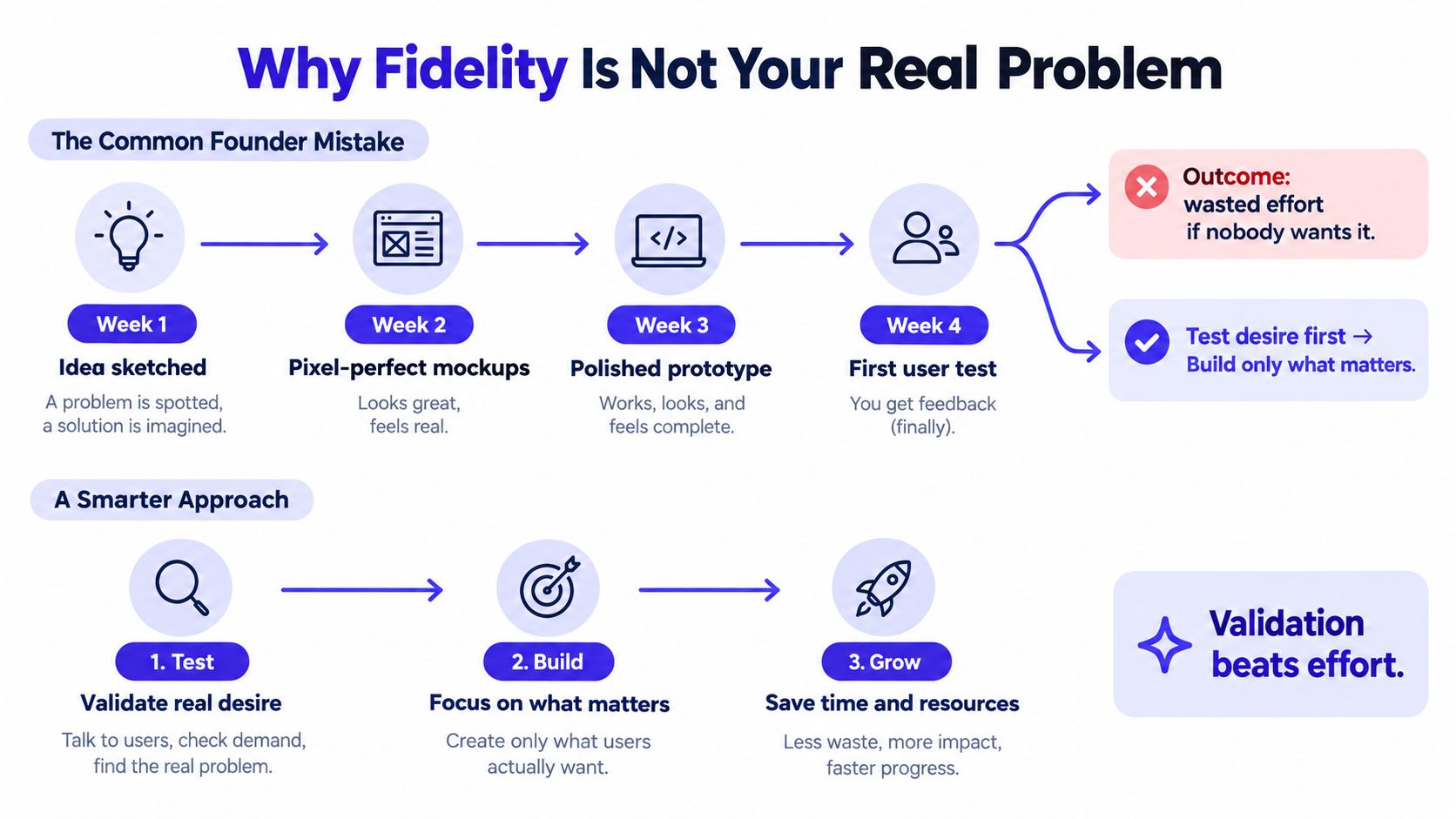
More fidelity doesn't automatically create better validation. It creates a more convincing artifact, which can be useful, but conviction isn't the same as evidence. Founders often spend weeks making a prototype feel like a finished product before checking whether the intended user recognizes the problem, understands the proposed value, or would change their behavior.
The practical rule is simple: fidelity should follow the decision you need to make. If you're deciding whether the navigation makes sense, paper cards or grayscale wireframes may be enough. If you're testing whether a technical integration works with real data, a static mockup won't help. If you're testing willingness to pay, neither artifact answers the question by itself.
What rapid prototyping was originally meant to solve
Modern product prototyping emerged from additive-manufacturing research in the early 1980s. In 1981, Hideo Kodama of Japan's Nagoya Municipal Industrial Research Institute developed photopolymer rapid-prototyping systems that used controlled ultraviolet exposure to build three-dimensional forms. Charles Hull later developed stereolithography, or SLA, which solidifies successive layers of liquid photopolymer with ultraviolet light. The technology was patented in 1986, and Hull's company, 3D Systems, released the SLA-1 in approximately 1987 to 1988, widely recognized as the first commercial 3D printer. This history of rapid prototyping describes the shift from computer-aided design files to physical models without conventional molds or tooling.
The important lesson isn't the machinery. Earlier conceptual or functional prototypes could take months and cost thousands of dollars, while rapid prototyping aimed to shorten the build, test, and revise cycle. Digital founders use the same logic with sketches, clickable flows, functional slices, and test releases.
A prototype isn't a miniature version of the final product. It's a decision instrument.
Use polish only when it earns its place
High fidelity becomes useful when roughness prevents a realistic answer. Visual hierarchy, realistic content, responsive behavior, animation, permissions, or external integrations may all require a more developed artifact. But adding those elements before identifying the critical uncertainty usually hides the problem beneath presentation quality.
A useful sequence looks like this:
- Explore the problem: Use interviews, observation, and rough sketches to understand the current behavior.
- Check the workflow: Use wireframes or a click-through flow to see whether users can complete the important task.
- Check feasibility: Build a narrow functional slice with real technical constraints.
- Check commitment: Use a landing page, concierge service, pilot, or constrained pre-order to observe behavior.
That sequence also connects prototyping with broader product optimization work, because each iteration should improve a measurable decision rather than merely improve appearance.
Practical rule: Don't increase fidelity because the prototype looks unfinished. Increase it because the next question can't be answered without more realism.
The Five-Stage Prototyping Loop
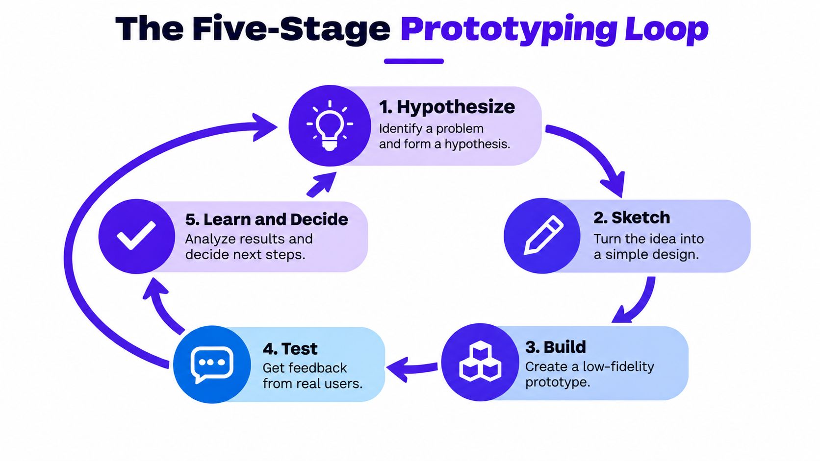
A productive prototype begins with a hypothesis, not a blank canvas. The hypothesis should describe a user, a problem, and an observable outcome. For example: “Independent consultants who manage projects across several clients will understand a single dashboard and use it to identify overdue work without opening multiple tools.”
That statement gives you something to investigate. “People will love my productivity app” doesn't.
Start with the user and the problem
1. Empathize through interviews and observation. Speak with people who experience the problem in their normal work, not just people who enjoy discussing new products. Ask what they did the last time the problem occurred, which tools they used, what they copied or tracked manually, and what happened when they ignored it.
Avoid leading questions such as “Would you use an app that automatically fixes this?” Ask about recent behavior instead. Past actions provide better problem evidence than hypothetical enthusiasm.
2. Define one specific problem and outcome. Narrow the scope until you can describe the test in one sentence. The outcome might be understanding a value proposition, finding a setting, completing a workflow, requesting access, booking a call, or agreeing to a paid pilot.
Write the threshold before building. For example, you might decide to revise a flow when users repeatedly choose the wrong navigation path or complete the core task materially below your target. The exact target belongs to your product and audience. The important point is deciding it before positive feedback tempts you to move the goalposts.
Generate alternatives before committing
3. Ideate several solutions. Sketch different ways to solve the same problem. One approach might automate the task, another might provide a checklist, and another might offer a service-assisted workflow. Comparing alternatives prevents the first interface you imagine from becoming an accidental product strategy.
Keep the sketches disposable. You're evaluating approaches, not defending artwork.
4. Prototype only the critical workflow. Build the narrowest path that can answer the current question. Start with paper or wireframes for information architecture. Move to an interactive click-through when you need to observe task behavior. Add visual polish, realistic data, animations, and integrations only after the basic workflow survives testing.
If the prototype requires physical fabrication, specialist materials, or a production method you don't have in-house, you can browse rapid prototype services to understand available manufacturing support. The principle remains the same for software: outsource or add complexity only when it helps answer the next meaningful question.
Test, revise, and repeat
5. Run scenario-based tests. Recruit representative users and give them a realistic situation, not a tour of your screens. Ask them to complete a task without narrating every decision for them. Observe where they hesitate, what they expect to happen, which errors repeat, and where they abandon the flow.
Record:
- Completion rate: Whether the participant reached the intended outcome.
- Time on task: How long the critical workflow took.
- Error count: Where participants chose the wrong action or misunderstood a control.
- Abandonment points: The exact step where they stopped.
- Qualitative comments: The language they use to describe the problem and solution.
A published usability study illustrates how quantified testing can be documented. Twenty users completed four tasks, producing a reported 100% task success rate and a System Usability Scale score of 82 in that specific study. Those findings are product- and sample-specific, not universal benchmarks, so use the reported usability study as an example of test documentation rather than a target every prototype must reach.
After each cycle, record the hypothesis, participant profile, task script, raw observations, decision, and exact changes. A prototype that changed after testing is more valuable than a prototype that merely survived a presentation.
Choosing the Right Fidelity Level
The best prototype is the least elaborate one that can answer the current question. Choosing the wrong level creates two kinds of waste: you spend time building details that don't matter, and you collect feedback from an artifact too artificial to reveal the core risk.
A Cambridge study of novice design teams reported an average perceived prototyping-success score of 4.0 and found statistically significant differences between prototype types. Feasibility-focused prototypes were judged more successful than desirability-focused prototypes, and solution-validation prototypes performed better than prototypes used during problem exploration. The study also found that high-fidelity prototypes were significantly more successful than low-fidelity prototypes for the tasks examined. The Cambridge prototyping study supports a nuanced conclusion: fidelity matters, but purpose determines whether it helps.
Low fidelity for problem framing
Use paper, sticky notes, a whiteboard, or basic wireframes when you're exploring:
- Information architecture
- Page hierarchy
- Navigation labels
- Alternative workflows
- The sequence of a task
- Whether users recognize the problem in your framing
Low fidelity keeps the conversation focused. Participants are more willing to challenge a rough concept, and you can discard a weak direction without feeling that you've wasted a polished design.
The limitation is obvious. A paper flow can't tell you whether animation feels natural, whether a data-heavy screen remains readable, or whether an API integration handles real conditions.
Medium fidelity for task validation
Use Figma, ProtoPie, or a comparable interaction tool when users need to tap, click, search, select, or move through a realistic sequence. A medium-fidelity prototype should contain enough content and states to make the critical task believable, but it doesn't need a complete visual system.
Build the unhappy paths as well as the ideal path. Include an empty state, a validation error, a disabled action, or a confusing permission step if that condition could affect adoption. A click-through that only demonstrates success can conceal the operational burden you'll face after launch.
High fidelity for feasibility and commitment
Use coded prototypes or a narrow MVP when the risk involves real data, performance, accessibility, authentication, external services, or an unfamiliar technical approach. A functional slice can expose constraints that design software cannot represent.
A no-code stack can be appropriate when you need to connect a form, database, workflow, and user-facing interface without building the entire backend. The right no-code platform for web applications depends on your integration and ownership requirements, so assess exportability, data access, permissions, and future migration before committing.
| Decision you need to make | Suitable starting point | Escalate when |
|---|---|---|
| Does the problem and structure make sense? | Paper or wireframe | Users disagree about the flow or labels |
| Can users complete the intended task? | Interactive click-through | Hidden states or realistic content affect behavior |
| Can the technical approach work? | Coded proof of concept | Real data, integrations, or performance are material risks |
| Will people commit commercially? | Landing page, concierge workflow, pilot, or pre-order | You need evidence beyond stated interest |
Don't build a high-fidelity prototype to impress yourself. Build it when a lower-fidelity artifact can no longer answer the question.
The Two Hidden Gaps in Most Prototype Guides
Most tutorials teach you how to assemble screens. They spend far less time on who should test those screens and what the prototype can prove. Those omissions create a dangerous illusion of progress: the founder has a link to share, a few positive comments, and no reliable evidence that the product addresses an urgent problem for a viable audience.
Gap one is audience quality
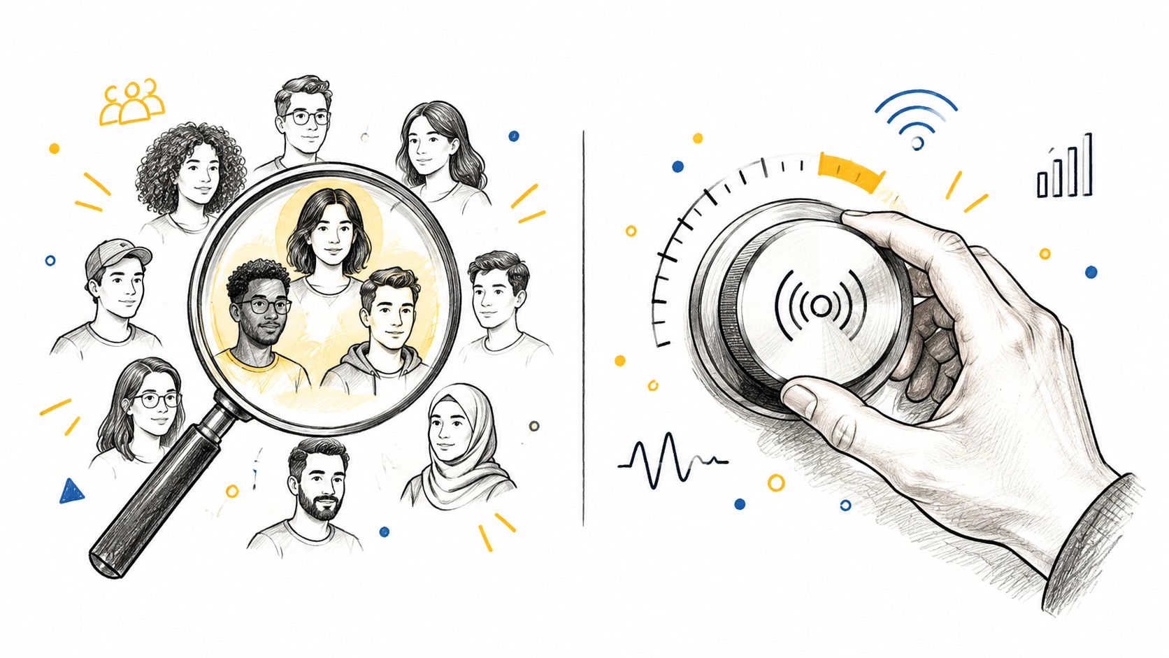
Recent UX research reports that 68% of organizations involve end users in prototype testing, while only 36% involve them during idea generation. The same research identifies recruitment as a leading obstacle for 46% of organizations, and insufficient resources are reported by 44%. The State of UX 2025 report shows why recruitment deserves its own operating process, not a casual request for feedback.
Friends, followers, fellow founders, and other designers are easy to reach. They may still be useful for detecting obvious confusion, but they usually don't represent the buyer, user, urgency, workflow, or purchasing authority that determines demand.
Screen participants by behavior:
- Problem exposure: Have they recently experienced the situation you're addressing?
- Current workaround: Do they spend time, money, or effort solving it today?
- Role: Are they the user, buyer, approver, or none of these?
- Urgency: What happens if they leave the problem unresolved?
- Context: Does their environment resemble the one your product must support?
Low-cost recruiting can start with professional communities, relevant newsletters, specialist groups, customer interviews through existing networks, or direct outreach to people whose public work demonstrates the problem. Explain the research clearly, ask for a short task session, and screen for actual experience rather than interest in startups.
Five carefully screened interviews can reveal more about problem language and workflow assumptions than a large pool of generic respondents. Qualitative findings still need behavioral validation later, but poor participant quality cannot be repaired with a more polished prototype.
Gap two is evidence confusion
An interactive prototype primarily tests comprehension, usability, and solution direction. It doesn't prove durable demand, willingness to pay, retention, operational feasibility, or acquisition economics. A person can click a fake door out of curiosity without completing onboarding, connecting data, inviting colleagues, or paying.
The highest-risk mistake is optimizing implementation before validating demand. Build the smallest artifact that tests one falsifiable assumption, such as whether a target user understands the value proposition, completes the primary flow, submits an email, books a call, or pays a deposit. A commonly cited analysis of 101 startup post-mortems found that 42% identified lack of market need as a failure reason, according to the early MVP validation analysis.
The audience is part of the prototype. If the participants don't experience the problem, their approval can mislead you.
A staged approach separates the questions. Interview for problem evidence, expose a solution concept to representative users, test the workflow interactively, then observe a realistic commitment action through a landing page, concierge service, pilot, or constrained pre-order.
Here's a useful distinction to keep visible during sessions:
- Stated interest: “I would use this,” “This looks useful,” or “Tell me when it launches.”
- Observed behavior: Completing a task, returning to the workflow, introducing a colleague, booking a call, providing data, or making a commercial commitment.
A prototype should generate the second type of evidence before you treat the first as meaningful.
The following walkthrough can help you think about how an early concept becomes a tested product, but don't copy its surface details without adapting the tasks and audience to your own market.
Building Your Staged Evidence Ladder
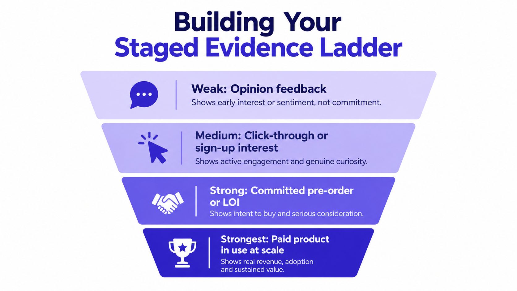
Validation isn't a switch that moves from “no” to “yes.” Evidence becomes stronger as the user's behavior becomes more realistic and the cost of commitment rises. A good ladder prevents you from asking a lightweight prototype to prove what only a live product or commercial test can establish.
Read each signal for what it can prove
Opinion feedback is useful for discovering vocabulary, objections, existing workarounds, and confusing assumptions. It tells you what people say they think. It doesn't establish that they'll change behavior.
Click-through or sign-up interest gives you a behavioral signal. A visitor chose an action, which is more informative than a compliment, but the action may still reflect curiosity. Measure what happens after the click, including whether the user supplies relevant information or completes the next step.
A committed pre-order, letter of intent, pilot agreement, or paid deposit tests a stronger form of intent. It introduces real friction and forces the buyer to prioritize the problem. Document exactly what was promised, because a vague commitment can still conceal different expectations.
Paid product usage tests a broader system. Users must understand the product, complete onboarding, tolerate its limitations, use it in context, and decide whether the value justifies continued effort. Retention, support burden, delivery cost, and acquisition economics become visible.
The product-validation guidance makes the central distinction clear: surveys and interviews can identify a problem, while landing pages, prototype tests, presales, and pilots are needed to observe commitment. A fake-door click may show curiosity without proving that users will complete onboarding, connect data, invite colleagues, or pay.
Keep an evidence package
For each cycle, save a short record containing:
- Target persona: The behaviorally defined user and buyer.
- Core job-to-be-done: The task they need to accomplish.
- Hypothesis: The assumption you're testing.
- Prototype link: The exact version shown to participants.
- Task script: The scenario and instructions.
- Raw completion data: Outcomes, errors, timing, and abandonment.
- Decision rule: What makes you revise, continue, narrow, or stop.
- Change log: What changed because of the evidence.
Rapid generation, including AI-assisted prototyping, makes this discipline more important. Faster production gives you more artifacts to test, but it doesn't make hypothetical feedback predictive. A quick prototype can accelerate learning only when you preserve the link between an assumption, an observed behavior, and a decision.
Don't change pricing, positioning, and feature scope in the same experiment if you want to interpret the result. Isolate the major variable, repeat the test with a comparable audience, and reject explanations that depend on favorable anecdotes.
Move toward paid development when the core workflow is understandable, representative users complete it, and commitment evidence supports the problem's commercial importance. Keep iterating when participants need heavy guidance, the audience is convenient rather than credible, or commitment disappears as soon as the interaction requires effort.
From Prototype to Launch - What Actually Happens
Maya started with a productivity tool for solo consultants who struggled to see which client tasks needed attention. Her first prototype was a paper flow with a dashboard, a client view, and an overdue-work filter. During sessions, users looked for overdue work inside each client area instead of the central dashboard. The flaw wasn't visual. The information architecture reflected Maya's mental model, not theirs.
She revised the structure before writing application code, then built an interactive version with representative content and realistic task scenarios. The next sessions focused on finding overdue work, changing its status, and identifying the next action. Maya tracked completion, errors, hesitation, and the language participants used when describing the result.
The prototype didn't validate demand. It showed that the proposed workflow was understandable enough to test commercially. Maya then created a landing page with a specific promise and invited qualified users to request a guided pilot. She used the conversations to test the workflow manually, observe repeat use, and learn which part of the outcome buyers valued enough to prioritize.
Friends had liked the original concept, but Maya ignored that feedback as market proof. She also resisted adding reporting, team permissions, and integrations before the core task worked reliably. Once the evidence supported the central job, she prepared the product, onboarding explanation, and launch materials. For the distribution stage, this guide to launching a SaaS can help organize the public release without turning launch preparation into a substitute for validation.
The sequence is deliberately unglamorous: identify the problem, test the structure, observe the workflow, measure commitment, then build the smallest paid product that delivers the promised outcome.
IndieTool helps indie founders distribute launched products through directory listings, search exposure, permanent do-follow backlinks, and lightweight analytics, while its free tools support naming, content, and launch preparation. Once your prototype has earned enough evidence to become a real product, visit IndieTool to prepare its public launch and put it in front of early adopters.