Indietool
Best AI Image Prompts: 2026 Guide for Product Visuals
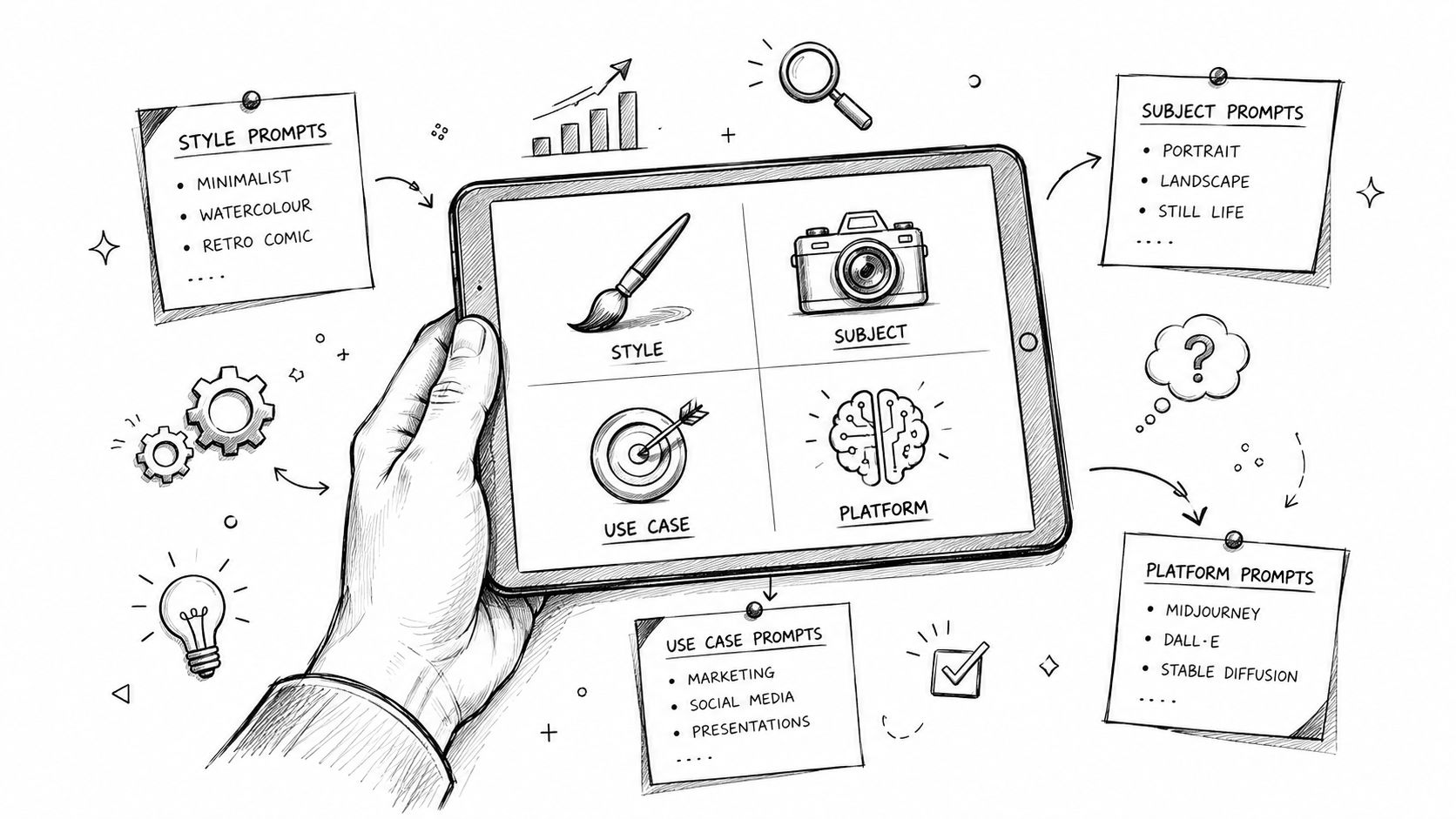
A long list of adjectives doesn't make an AI image prompt strong. “Cinematic, beautiful, futuristic, ultra-detailed” may produce attractive decoration, but it doesn't tell the generator who needs to understand the image, what action the image should support, or which detail deserves attention first.
The best AI image prompts are built around a job. They define the viewer, communication goal, subject, composition, lighting, context, and constraints. That matters especially for indie products, where one visual may need to explain a feature, establish category relevance, support a launch, or make a directory listing easier to understand.
The examples below focus on ten practical product-communication jobs, plus a trust-sensitive social-proof use case. Each prompt connects visual hierarchy with credibility, audience fit, negative prompts, and platform-specific tuning. Generated imagery can support a product story, but it shouldn't be presented as a real interface, customer testimonial, user group, result, or metric unless those elements come from verified source material.
For indie founders preparing listing, launch, and social assets, IndieTool can be a relevant distribution context. The visual still has to do its communication job before it reaches any directory or channel.
Table of Contents
- 1. PromptHero
- 2. Detailed Product Screenshot With Technical Specifications
- 3. Feature Spotlight Detail Shots
- 4. Problem-Solution Visual Narratives
- 5. Target Audience Persona Representation
- 6. Founder-Focused Lifestyle And Team Imagery
- 7. Category-Specific Industry Context Imagery
- 8. Data Visualization And Analytics Display Prompts
- 9. Integration And Ecosystem Context Imagery
- 10. Growth And Success Trajectory Visualization
- 11. Social Proof And Community Imagery
- Top 11 AI Image Prompts Compared
- Turn Prompt Ideas Into A Repeatable Visual System
1. PromptHero
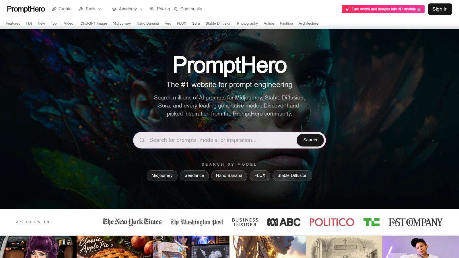
PromptHero is useful when the problem isn't “I need one more creative idea,” but “I need to understand how people are prompting this model and why the outputs look the way they do.” Its searchable catalog brings together prompts for image and video systems, including Midjourney, Stable Diffusion, FLUX, Sora, Veo, ChatGPT Image, Seedance, and Nano Banana. Model-specific pages, example outputs, parameters, creator profiles, and popularity signals make it easier to study a prompt as a reproducible workflow rather than a mysterious sentence.
The platform also offers discovery paths by theme and medium, including photography, fashion, anime, architecture, and video. Its Academy and model directory add context for users who are still learning the difference between a prompt, a checkpoint, a LoRA, and a control workflow. That breadth is its main advantage, but it can also become a distraction. A popular aesthetic prompt may be visually impressive and still be useless for a product listing.
Practical rule: Borrow the structure of a prompt, not just its adjectives. Identify the subject, camera position, light, context, and constraints that produced the useful result.
The scale of the prompt ecosystem explains why a library can be valuable. Early compositional text-to-image research used narrowly scoped datasets, while JourneyDB later documented 4 million generated image-prompt pairs, 1 million captions, and more than 8 million VQA annotations. MONET reported 104.9 million image-text pairs, showing how prompt quality has become a large-scale evaluation problem rather than a niche artistic trick. These figures are documented in the NeurIPS benchmark and dataset paper.
PromptHero is the right choice for research, reference gathering, and cross-model comparison. It isn't a substitute for product knowledge, a real screenshot, or a clear communication brief. Start with PromptHero's best AI image prompts, save patterns that match your job, then rewrite them around your audience and evidence.
2. Detailed Product Screenshot With Technical Specifications
A product mockup has one job: help a viewer understand what the product is and why its interface matters. A prompt that only says “modern SaaS dashboard on a laptop” usually creates a polished but generic scene. Specify the primary screen, the dominant workflow, device frame, camera angle, material, lighting, and the hierarchy of interface elements.
Prompt template: A realistic product hero image for an analytics SaaS, laptop open at a three-quarter angle, primary screen showing a clean website-performance dashboard, one large trend panel, two secondary cards, restrained sample data, navy and mint brand palette, soft studio lighting, subtle desk context, generous negative space on the left for headline copy, crisp product-focused composition.
Use a negative prompt such as:
distorted text, malformed buttons, duplicate panels, impossible charts, random logos, unreadable navigation, excessive reflections, cluttered desk, warped laptop, fake user data presented as real
Midjourney is a strong choice for polished composition and art direction. Stable Diffusion is better suited to controlled iteration, inpainting, and targeted corrections. DALL·E works well when you want to describe the scene in natural language without building a complex parameter system.
The safest workflow for an IndieTool product listing is to create a hero image that communicates category and use case, then produce a secondary feature visual with a tighter crop. Generated screens should remain conceptual. If the image contains exact interface copy, live metrics, customer information, or a recognizable product state, supply the actual screen separately and composite it in a design tool.
3. Feature Spotlight Detail Shots
A feature spotlight works because it gives the viewer one subject to understand. A crowded product tour forces the eye to jump between navigation, charts, controls, and decorative context. A close-up of an export control, filter panel, integration state, or configuration screen can explain more with less visual noise.
Write the prompt around the focal area and its interaction state:
Close-up product interface detail showing an advanced filter panel expanded over a clean analytics workspace, active date-range control, highlighted filter chips, one clear result state, subtle annotation circle around the saved-filter action, neutral background, generous whitespace, realistic screen lighting, documentation-ready composition.
A useful negative prompt includes:
tiny unreadable labels, invented feature names, duplicated controls, cluttered overlays, incorrect interaction state, excessive annotation, distorted icons, low contrast, cropped focal element
Stable Diffusion is the practical choice when the same feature needs several variations or when targeted corrections matter. Exact labels should still be added or corrected in Figma, Photoshop, or another design tool. Image generators remain unreliable at precise interface text, especially when the visual contains many small controls.
Use this format for documentation, release notes, product updates, and a listing gallery:
- Name one capability: Don't combine search, export, permissions, and billing in one frame.
- Show one state: Choose active, disabled, loading, configured, or completed.
- Mark the focal area lightly: An annotation should guide attention, not replace explanation.
- Add the actual label later: Treat generated text as layout guidance, not approved product copy.
The image should answer a narrow question, such as “Where does a user configure this?” It shouldn't pretend to prove that the feature works in a live environment.
4. Problem-Solution Visual Narratives
A before-and-after visual can communicate a product's value quickly, but only when the problem is concrete. “Stressed person becomes successful” is a cliché. “A solo marketer manually reconciles campaign exports, then reviews one organized workspace” gives the generator a visible situation and a credible transformation.
Split-panel editorial illustration for a small-business marketing workflow. Left panel shows one marketer at a cluttered desk comparing disconnected campaign reports, muted cool light, scattered tabs and notes. Right panel shows the same person reviewing one organized workspace with a clear workflow, warmer balanced light, tidy desk, identical clothing and room, restrained expression, strong left-to-right visual progression, no text.
Use a negative prompt against:
rocket imagery, magic transformation, exaggerated celebration, impossible productivity, generic office stock photo, unreadable text, duplicated person, inconsistent clothing, extreme facial emotion, luxury symbolism
Keep the subject, camera height, and environment consistent across both panels. Contrast should come from organization, lighting, and object placement, not from an implausible fantasy scene. A launch post, newsletter, or directory description can use the image to explain the problem the product addresses.
The image doesn't prove that customers achieved the depicted result. Pair it with precise copy such as “A visual explanation of the workflow” rather than a claim about actual customer outcomes. That distinction protects credibility while allowing the visual to simplify a complex value proposition.
5. Target Audience Persona Representation
Persona imagery should show a person using a product in a relevant context, not a generic stock character holding a laptop. Profession, environment, task, device, mood, and point of view all shape audience fit. A freelance designer might be reviewing client assets at a home studio, while a solo developer might be testing an API beside a local development environment. A busy parent, small-business owner, or remote worker needs a different setting and task.
Useful prompt directions include:
- Freelance designer: Working alone in a compact studio, reviewing brand assets and client feedback, realistic desk clutter, natural afternoon light.
- Solo developer: Debugging a deployment workflow in a quiet home office, terminal and product interface visible, focused posture.
- Busy parent: Managing a short planning session between household tasks, candid environment, practical rather than aspirational mood.
- Small-business owner: Reviewing inventory or marketing tasks in a real storefront or back office, product context visible.
- Remote worker: Joining a focused planning session from a modest home workspace, natural camera perspective and believable posture.
Add a negative prompt for:
staged pose, tokenistic diversity, exaggerated lifestyle styling, unnatural device interaction, perfect office, identical faces, age stereotype, forced smile, unrealistic hands
Keep a small image set consistent by reusing the same lens language, color treatment, lighting direction, and crop. Don't imply that one generated person represents an entire market. Use several distinct contexts, and write copy that describes the intended audience without excluding people who don't match the image.
The best persona visual creates recognition through the task and environment. It doesn't reduce an audience to clothing, age, ethnicity, or a stock stereotype.
6. Founder-Focused Lifestyle And Team Imagery
Founder imagery earns attention when it captures work in progress. Generic startup art, glass offices, staged smiles, and oversized whiteboards say very little about an indie business. Specify the stage of work, team size, setting, time of day, and action instead.
A solo-founder prompt might show one person testing a product beside notes and a laptop. A small whiteboard session can show two or three people resolving a workflow question. A launch-milestone image might focus on a founder reviewing a release checklist, while a remote-call scene can show a candid planning moment with one screen and a believable home environment.
Use a negative prompt such as:
staged corporate smiles, duplicate people, distorted hands, fake office, oversized team, generic startup stock photo, artificial facial expressions, unreadable whiteboard, random logos, luxury workspace
Consistency matters if the founder appears across several assets. Reuse a restrained palette, similar framing, and a stable description of clothing and environment. Reference images or post-production can help, but don't imply that the generated person is a real founder or that the scene records a real event.
This approach supports founder storytelling around an IndieTool listing, social post, or newsletter feature without inventing a team, office, milestone, or customer meeting. If the actual team exists, real photography or clearly labeled composites will usually carry more trust than synthetic portraits.
7. Category-Specific Industry Context Imagery
Category context should orient the viewer before they read the product description. An AI tool might belong in a focused model-testing workspace. A design tool might appear beside wireframes and visual references. A fintech product needs a restrained financial operations context, while a productivity app may benefit from a calm planning environment.
Try prompt directions like these:
- AI tool: Researcher reviewing model outputs in a controlled evaluation workspace, product interface central, minimal technical context.
- Design tool: Designer comparing layouts, color swatches, and component states, interface visible without visual clutter.
- Fintech product: Small-business operator reviewing cash-flow planning in a professional office, restrained palette and clear hierarchy.
- Productivity app: Remote worker organizing tasks around a realistic workday, product screen as the primary subject.
- Web3 product: Developer reviewing wallet or protocol activity in a sober technical setting, no speculative imagery.
The negative prompt should remove category clichés:
excessive neon, unrelated props, generic futuristic city, random coins, stereotypical hacker, floating holograms, irrelevant equipment, crowded scene, product hidden in background
Name the audience, setting, objects, visual language, and product role. The image should tell visitors what kind of problem the product belongs to while leaving its distinctive value visible. A category scene isn't a replacement for a product screenshot, but it can provide useful orientation in a directory gallery or launch campaign.
Avoid claiming that the image itself improves search visibility or proves category authority. Its role is simpler, it helps a visitor understand context quickly.
8. Data Visualization And Analytics Display Prompts
Generated dashboards are useful for showing a product's visual language. They're unsafe as evidence. Numbers, labels, trends, axes, and rankings can be invented or malformed, even when the overall composition looks credible.
Clearly illustrative analytics dashboard concept for an SEO product, large abstract trend chart with intentionally non-specific values, labeled visual regions without readable claims, supporting cards for crawl health and content planning, accessible contrast, restrained blue and green palette, clean desktop interface, no customer data, no performance promise.
Use a negative prompt for:
fake statistics, impossible axes, garbled labels, fabricated client names, exact revenue claims, misleading upward trend, duplicate charts, unreadable legends, false testimonial, deceptive dashboard
Choose the asset type according to the communication need:
- Chart-like AI image: Best for atmosphere, layout exploration, or a conceptual product hero.
- Actual screenshot: Best when the interface, labels, workflow, or feature must be trusted.
- Designed infographic: Best when real metrics, definitions, dates, and comparisons matter.
For Analytics, Marketing, and SEO products, the safest workflow is to generate the composition first, then add approved metrics or interface captures separately. Never use generated numbers as customer evidence, and don't let a rising line imply a measured result without supporting data.
Visual polish can explain a product's capability. It can't validate its performance.
9. Integration And Ecosystem Context Imagery
An ecosystem image should explain a workflow, not display a wall of logos. Start with ordered stages and data movement. Put the product at the center, show complementary tools around it, and make the direction of the flow obvious.
Clean technical workflow illustration for a marketing automation product. Central product receives approved content from a planning tool, sends campaign data to an analytics platform, and passes alerts to a team workspace. Three ordered stages, directional connectors, clear spacing, restrained interface cards, product remains largest visual element, professional developer-focused composition.
The negative prompt should include:
incorrect brand marks, invented logos, tangled connection lines, unreadable labels, duplicated tools, random integrations, overloaded architecture diagram, floating icons, unclear direction, product hidden among logos
Replace generated marks with approved brand assets during post-production. This is especially important when a partner's identity, API name, or integration status matters. The image should also be updated when the actual ecosystem changes, otherwise it can create an inaccurate impression of compatibility.
Technical buyers need hierarchy. They should be able to identify the product, understand what enters it, see what it sends onward, and recognize the use case without decoding a decorative network. A simple three-stage workflow will often communicate more than a dense cloud of every possible integration.
Use this visual for a developer landing page, product listing gallery, or integration announcement. Keep the accompanying copy exact about what is supported, available, or planned.
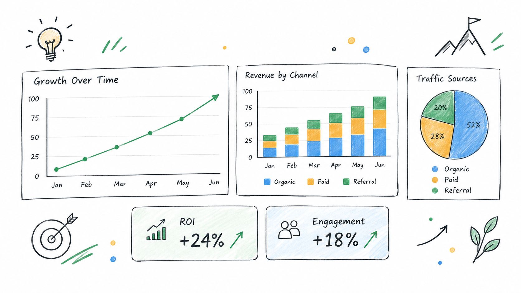
10. Growth And Success Trajectory Visualization
A growth image can express possibility without pretending to document results. The credible version uses explicit stages, a consistent subject, and restrained visual change. It shows how an idea becomes a product, how a solo project develops into a team workflow, or how one niche expands into related use cases.
Three-frame editorial sequence showing a solo founder moving from a rough product idea to a tested interface and then to a small, focused team workflow. Same workspace evolves gradually, tools become more organized, product remains central, realistic working conditions, modest milestone cues, no luxury office, no exaggerated celebration, calm documentary lighting.
For an idea-to-product narrative, show notes, prototype, and usable interface. For a niche-to-segment narrative, show one clear initial audience followed by adjacent contexts, not universal market domination. For a solo-to-team narrative, add collaborators only at the stage where the story supports them.
Use a negative prompt such as:
rocket cliché, impossible growth curve, luxury car, champagne celebration, unsupported revenue, fake user count, instant scale, oversized company, generic success symbolism, futuristic city
The image should be paired with precise copy. “Possible product journey” is different from “our product generated this growth.” If actual milestones exist, add them as verified text or real screenshots outside the generated image.
The strongest trajectory visual communicates progression through earned detail. It doesn't need spectacle. A more organized workflow, clearer product, or broader but still coherent context can carry the story without overpromising.
11. Social Proof And Community Imagery
Synthetic social proof is where visual creativity can become deception. Never present generated users, ratings, testimonials, review cards, customer quotes, or case-study scenes as real evidence. A smiling group around a product can suggest adoption that hasn't been verified, even if no explicit claim appears in the image.
Safer prompt patterns make the status clear:
Abstract editorial illustration of a diverse product community sharing ideas around a central interface, no identifiable users, no ratings, no testimonials, no brand claims, clearly conceptual composition.
Or:
Clearly labeled concept review card for a fictional product feedback workflow, placeholder text blocks only, no quotation marks, no star rating, no customer identity, clean editorial layout.
For a general collaboration scene:
Conceptual illustration of several remote collaborators reviewing a shared workspace, no visible names or claims, interface shown as abstract panels, realistic but clearly non-documentary composition.
Negative prompts should include:
fake identities, fabricated quotes, inflated ratings, deceptive UI, invented case study, realistic testimonial, customer logo, false review count, identifiable synthetic user, unreadable claim text
Before publishing, check whether the visual could reasonably be mistaken for evidence. Label it as generated or conceptual where necessary, remove invented interface copy, and replace it with real feedback when that feedback becomes available. A real customer quote in a designed card is more valuable than a synthetic quote in a polished scene.
Community imagery can communicate belonging and collaboration. It can't manufacture trust.
Top 11 AI Image Prompts Compared
| Item | 🔄 Implementation Complexity | ⚡ Resources & Tools | ⭐ Expected Quality / Effectiveness | 📊 Ideal Use Cases / Impact | 💡 Key Advantages & Tips |
|---|---|---|---|---|---|
| PromptHero | Low–Medium, web platform with ready UX and curation workflows | Browser access, optional subscription; content contributed by community | ⭐⭐⭐⭐, strong for discovery and reproducibility | Catalog discovery, learning prompt engineering, quick experiment generation | Built-in model collections, Academy resources, community-ranked prompts; use for multi-model prompt research |
| Detailed Product Screenshot with Technical Specifications | High, precise prompt engineering and iterative refinement | Midjourney / Stable Diffusion / DALL·E; high-res outputs and post-editing tools | ⭐⭐⭐⭐, polished hero images possible with effort | IndieTool listing hero images, product pages, marketing visuals | Specify screen hierarchy, camera/lighting, include negative prompts; treat as concept art and composite real UI if needed |
| Feature Spotlight Detail Shots | Medium, focused composition and accurate UI element prompts | Stable Diffusion preferred for repeatability; inpainting tools | ⭐⭐⭐, high clarity for individual features when prompts are precise | Documentation, feature galleries, case studies | Zoom into UI, annotate selectively, add real labels in design tools for accuracy |
| Problem-Solution Visual Narratives | Medium, requires clear narrative structure and balanced composition | Any capable image model; controlled prompts for contrast and staging | ⭐⭐⭐⭐, strong at conveying value proposition succinctly | Launch posts, conversion-focused listings, newsletters | Define single pain point and visible transformation; avoid clichés and unreadable text |
| Target Audience Persona Representation | Medium, careful persona definition to avoid stereotypes | Any image model plus prompts specifying demographics & context | ⭐⭐⭐, effective for relevance and CTR when done thoughtfully | Directory thumbnails, audience-targeted marketing, storytelling | Specify profession, environment, and natural interactions; generate multiple variants to avoid tokenism |
| Founder-Focused Lifestyle and Team Imagery | Medium, needs consistent style and candid action prompts | Any image model; emphasis on recurring people/style consistency | ⭐⭐⭐, builds emotional connection if authentic-looking | Founder storytelling, social posts, newsletter features | Specify team size, stage, and environment; avoid staged poses and uncanny faces |
| Category-Specific Industry Context Imagery | Medium–High, domain-specific prompting and visual language research | Any image model plus category research and references | ⭐⭐⭐⭐, quickly signals product category and credibility | Category landing pages, directory browsing, SEO-oriented listings | Name category, include relevant tools/props, avoid futuristic neon stereotypes |
| Data Visualization and Analytics Display Prompts | High, precise chart specs and careful labeling; post-editing usually required | Infographic-capable models; design tools to add real metrics | ⭐⭐⭐, visually compelling but numbers are not reliable evidence | Analytics/marketing product listings, illustrative dashboards | Specify chart types and ranges; add real data in post-production and avoid fabricated stats |
| Integration and Ecosystem Context Imagery | High, requires accurate logo use and clear flow hierarchy | Image model + approved brand assets and vector editing tools | ⭐⭐⭐, effective for developer/technical audiences when accurate | API docs, B2B marketing, platform compatibility visuals | Center product, show directional data flow, replace logos with approved assets after generation |
| Growth and Success Trajectory Visualization | Medium, sequential composition and restrained metaphor use | Infographic-capable models; timeline layout tools for post-editing | ⭐⭐⭐, aspirational and motivational if not overstated | Pitch decks, growth-focused marketing, milestone storytelling | Use explicit stages and earned milestones; avoid rocket clichés and impossible curves |
| Social Proof and Community Imagery | Medium, ethical constraints increase complexity (labeling/accuracy) | Image model; ideally real testimonials and post-production labeling | ⭐⭐–⭐⭐⭐, can suggest trust but risks authenticity concerns | Early-stage trust-building, community visuals, concept review cards | Never present fabricated testimonials as real; clearly label generated imagery and replace with real feedback when possible |
Turn Prompt Ideas Into A Repeatable Visual System
The best AI image prompts aren't isolated recipes. They're working documents for a repeatable visual system. Start by choosing one communication job, such as explaining a feature, establishing category context, or showing a workflow. If the image has to explain three unrelated things, split it into several assets.
Identify the audience and channel before writing style language. A directory thumbnail needs a clear subject at a small size. A product page hero can support more environmental context. A social post may need stronger contrast and a crop that survives mobile viewing. The same prompt shouldn't be copied unchanged across every placement.
Write the subject and composition before adding aesthetic terms. State what appears first, what supports it, where the viewer's eye should go, and which area needs whitespace for copy. Then define lighting, material, camera position, color treatment, and environment. Add a negative prompt that targets the failure modes of the specific job, such as garbled labels for interfaces, fake evidence for analytics, or duplicated people for team imagery.
Generate controlled variations rather than changing every variable at once. Keep the subject and composition stable while adjusting camera angle, palette, crop, or background. Inspect every output for distorted text, malformed hands, impossible data, incorrect logos, inconsistent faces, and visual claims that the product can't support.
Platform choice should follow the kind of control you need. Midjourney is useful for art direction, visual polish, and composition exploration. Stable Diffusion is better when you need iterative control, inpainting, reference workflows, or local refinements. DALL·E is practical for natural-language ideation and broad scene direction.
Model choice matters more than generic prompt folklore. A 2026 benchmark tested four production text-to-image systems on 48 difficult prompts. On identical prompts, Gemini 3 Pro Image scored 84.8 out of 100, while FLUX.2 scored 82.3, illustrating that a prompt's performance can change with the target engine. The benchmark is available in the 2026 text-to-image evaluation. Test prompts in the system you intend to use instead of treating any library as universal.
Prompt helpers also deserve skepticism. In a large experiment involving 1,893 participants and more than 18,000 prompts, moving from DALL-E 2 to DALL-E 3 contributed part of the improvement, while users also changed their prompting behavior and made prompts 24% longer and more descriptive. Automatic rewriting reduced DALL-E 3 performance by 58% relative to the baseline in one study. The findings are summarized by MIT Sloan. Use rewriting as an experiment, not as an automatic upgrade.
Before exporting, check:
- Authenticity: Don't present generated interfaces, people, metrics, testimonials, or events as real.
- Accessibility: Maintain readable contrast, meaningful alt text, and copy that doesn't depend on color alone.
- Consistency: Reuse palette, crop logic, lighting, and product hierarchy across the asset set.
- Labeling: Mark conceptual or generated visuals when viewers could mistake them for evidence.
- Accuracy: Add real UI, approved logos, verified metrics, and exact labels separately.
- Formats: Export versions suited to the directory, product page, email, and social crop instead of forcing one image everywhere.
Indie founders can use IndieTool as one possible distribution context for a product listing and related launch assets, but distribution doesn't rescue an unclear visual. Choose the communication purpose first, adapt the prompt to the platform, and treat generated imagery as a controlled component of the message rather than proof of the product's performance.